Color is all around us. It’s the blue in the endless sky. It’s the green in the swaying trees. It’s the purple in the Cadbury chocolate wrapper you reach for every afternoon when you need a sugar hit (no? Just us?) Color is such an important part of our daily lives, that it’s kinda hard to imagine a world without it. It’s no surprise then, that color can have quite an emotional effect on us!
In fact, color is a strategy many savvy marketers employ when they want their audience to think about their brand in a certain way, or take a specific action. Even just think about traffic lights — we associate green with ‘go’ and ‘red’ with stop, which is why these are often used in buttons in web design, too.
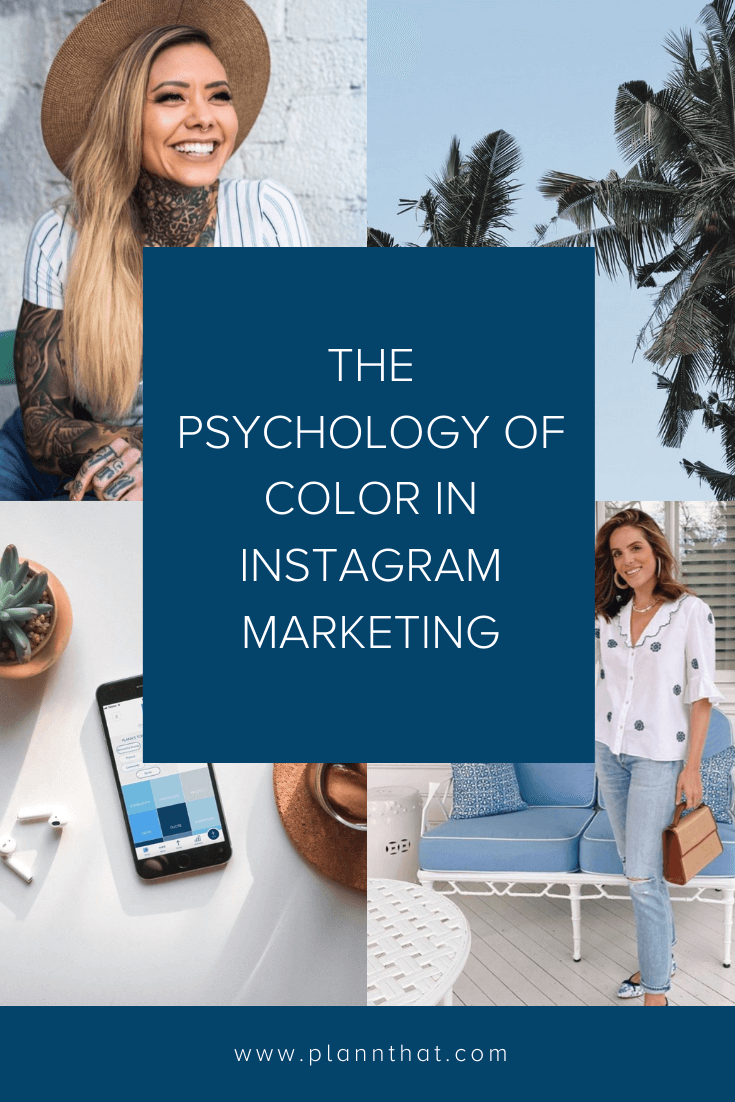
The good news is, you can too use the psychology of color to your advantage, too when planning your Instagram feed. By taking into account the way different colors make us feel, you can curate your Instagram feed in a way that creates your desired effect. In this article, we go beyond the aesthetics and delve into the psychology behind some of your favorite colors — and how you can use them yourself.
What is the psychology of color?
While color psychology has been around in the art, marketing and science worlds for centuries, there’s still not a lot of concrete evidence around what seeing color actually does within our brains. However, there’s plenty of anecdotal evidence to suggest that seeing different colors can affect our moods and influence how we think and act. For example, one study showed that warm color placebo pills were found to be more effective than cool-colored placebo pills (spoiler alert: they were all the exact same pills — because, placebo!) Other research has found that the color red can make people react with greater speed and force — which is essentially a more grown-up way of saying “red ones go faster!” Plus, there’s anecdotal evidence to suggest that installing blue streetlights can lead to reduced crime in those areas.
Most color psychologist researchers agree that our reaction to different colors comes down to the deeply ingrained associations we have with them — due to cultural conditioning. This is why a color can mean one thing to one person, and something completely different to the next! That said, just like most of us can agree that yellows and greens are the duds of the Starburst packet, there are also a few color associations most of us could probably agree on.
What are some of the most common color associations?
Red color associations: Power, passion, aggression, love, strength
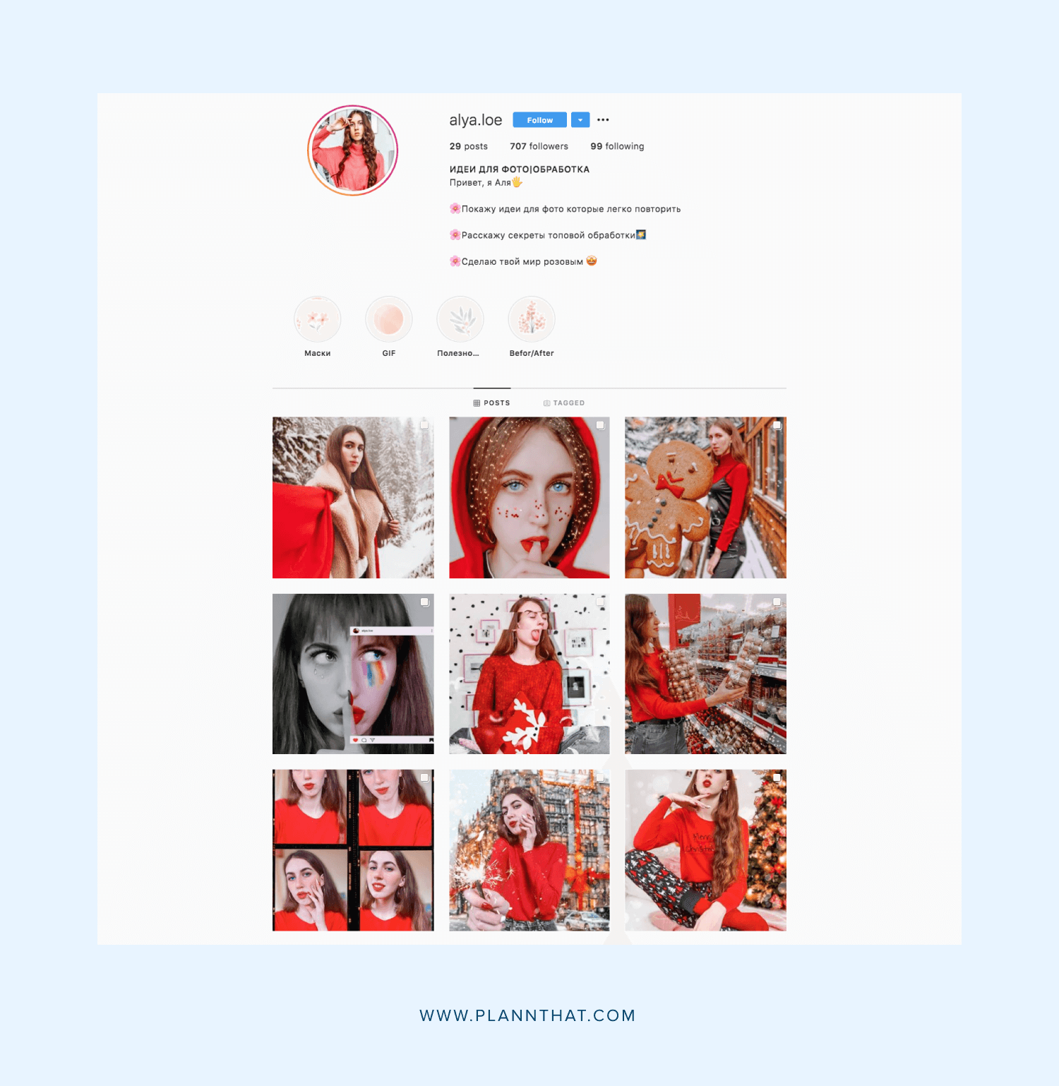
What type of brands should use red: Let’s just get one thing straight: red is NOT for brands for that want to play it safe! It’s for those who aren’t afraid to stand out, take a stand and be a little bit ‘extra!’ It tends to work well for brands with a rebellious or ‘kickass’ brand personality, or those going for a bit of a retro vibe
Blue color associations: Harmony, health, serenity, stability, trust, peace
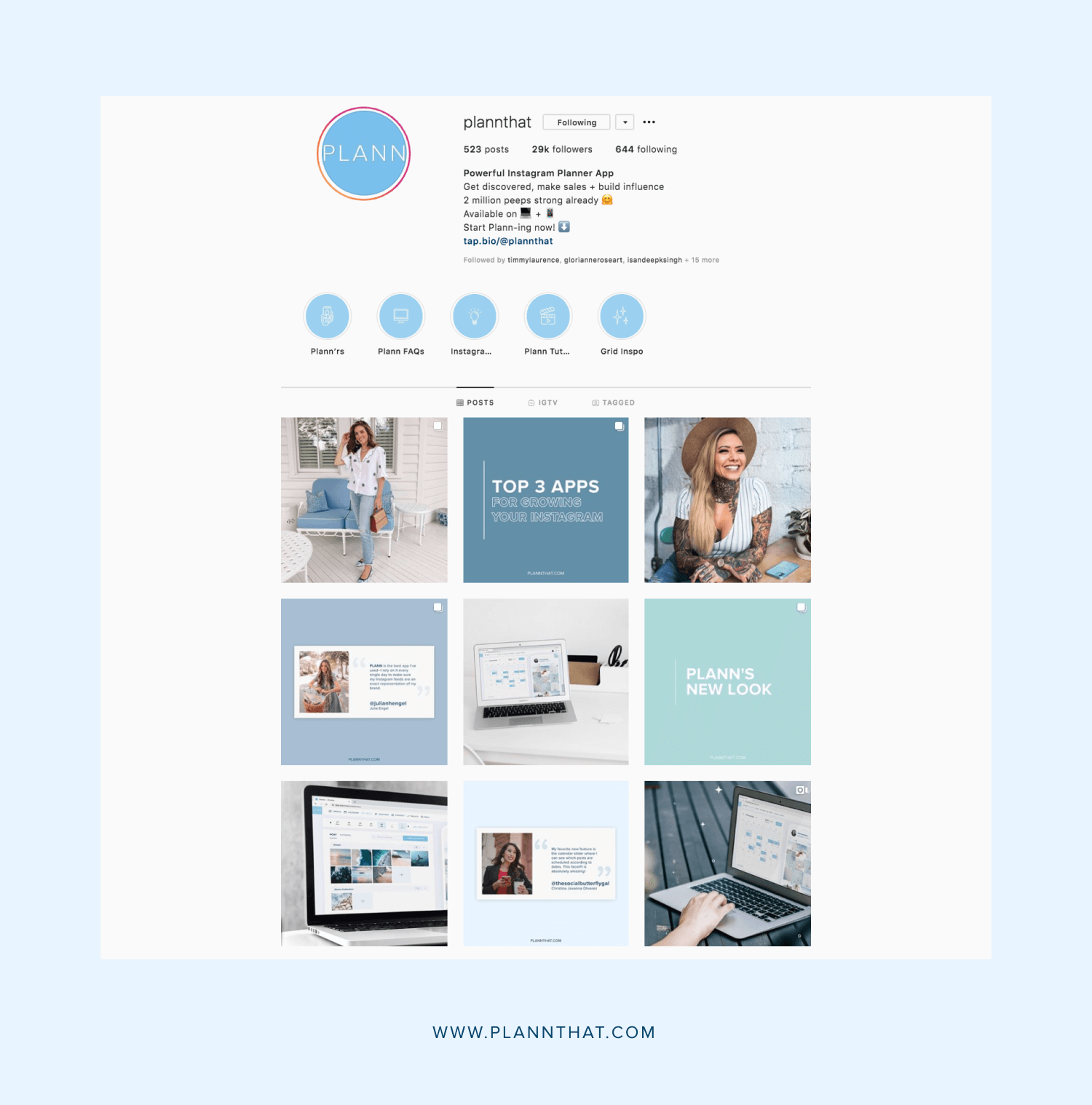
What type of brands should use blue: Blue is a great option for anyone who wants to give their brand a relaxing, harmonious and chilled-out feel. Lighter or teal varieties are popular amongst travel bloggers thanks to the beachy, tropical vibe. It’s also popular amongst tech brands (helllooo, Plann!) Meanwhile, a darker or navy blue is often used by corporate brands who want to emanate safety and trustworthiness.
Yellow color associations: Cheerfulness, positivity, joy, fun, energy
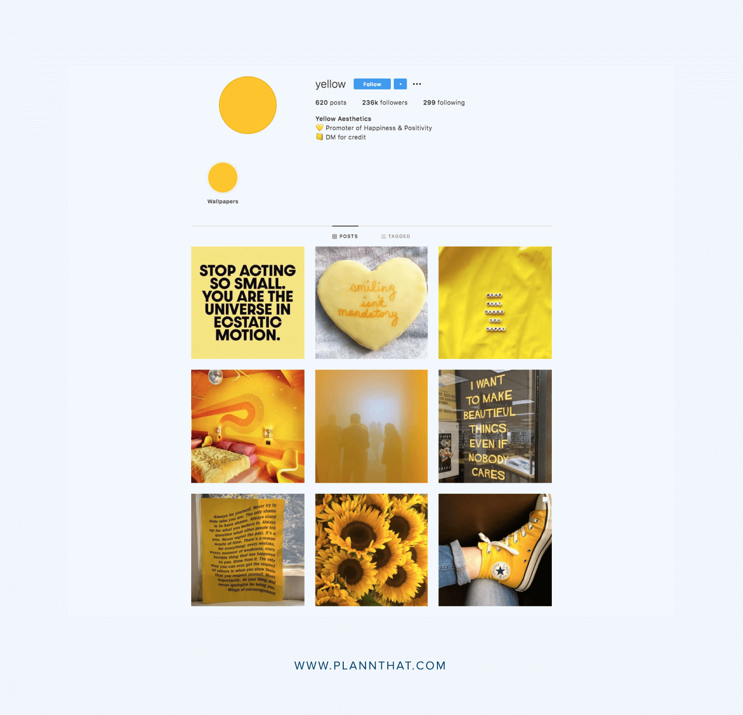
What type of brands should use yellow: Brands that want to appear friendly, approachable and fun should say ‘hello’ to yellow! It’s a popular choice amongst beauty, food and kids product brands
Green color associations: Nature, freshness, wealth, growth, stability
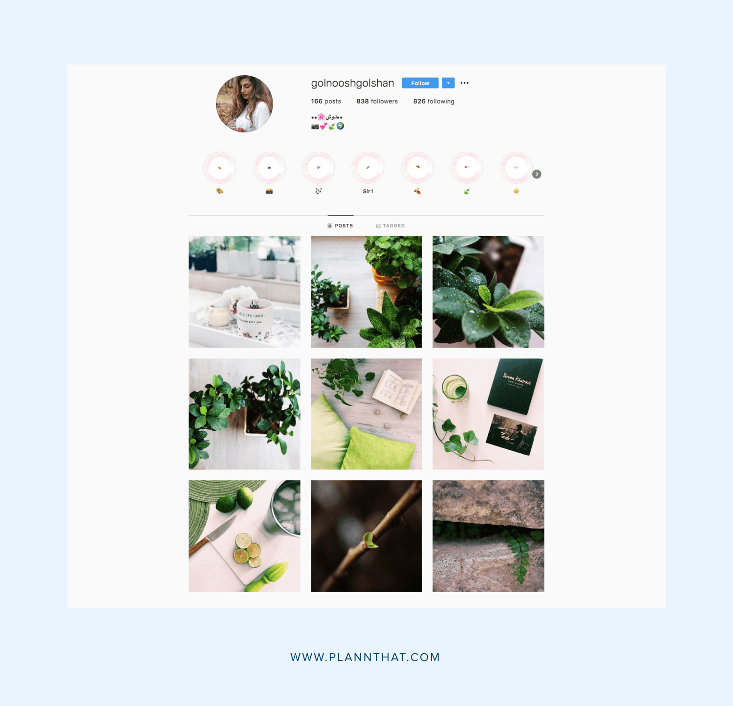
What kind of brands should use green: If health, wellness, sustainability, eco-friendly or organic are words you use anywhere in your bio, consider going green! Thanks to its natural and revitalising feel, it’s perfect for health influencers and brands, yoga teachers and anyone who identifies as a bit of a hippy!

Purple color associations: Luxury, prestige, ambition, mystery, creativity
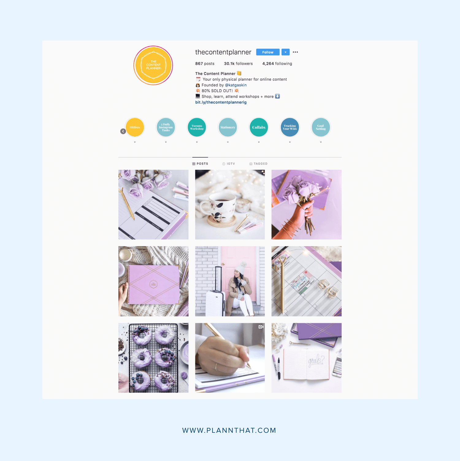
What type of brands should use purple: Purple has long been considered the ‘royal’ color (fun fact: this is because Elizabeth I forbade anyone but close members of the royal family from wearing it because the dye was so expensive to make!) So, it’s an awesome choice for luxury and high-end fashion and lifestyle brands. However, it’s also great for female empowerment brands, thanks to its feminine-yet-powerful feel.
Pink color associations: Femininity, softness, nurture, sweetness
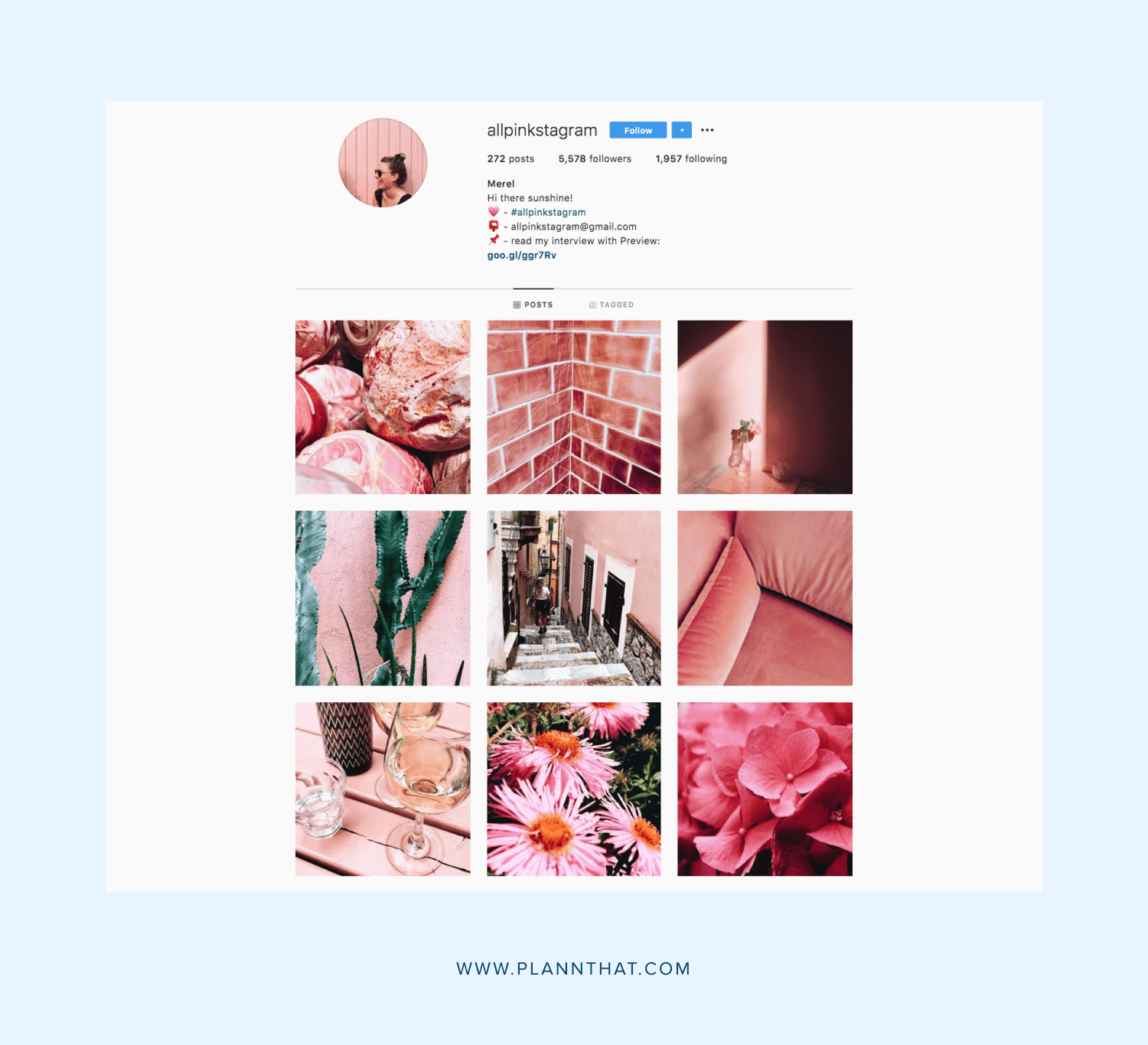
What kind of brands should use pink: We’re not going to go all old-school and say ‘pink is for girls,’ because it ain’t 1959, folks! But, pink is a great choice for any brand that wants to exude a sense of femininity and nurture — whether they’re for women or not. However, ‘hot’ pinks can also have a more playful and vibrant feel, so it all depends on how you use it!
Brown color associations: Earth, groundedness, reliability, wholesomeness
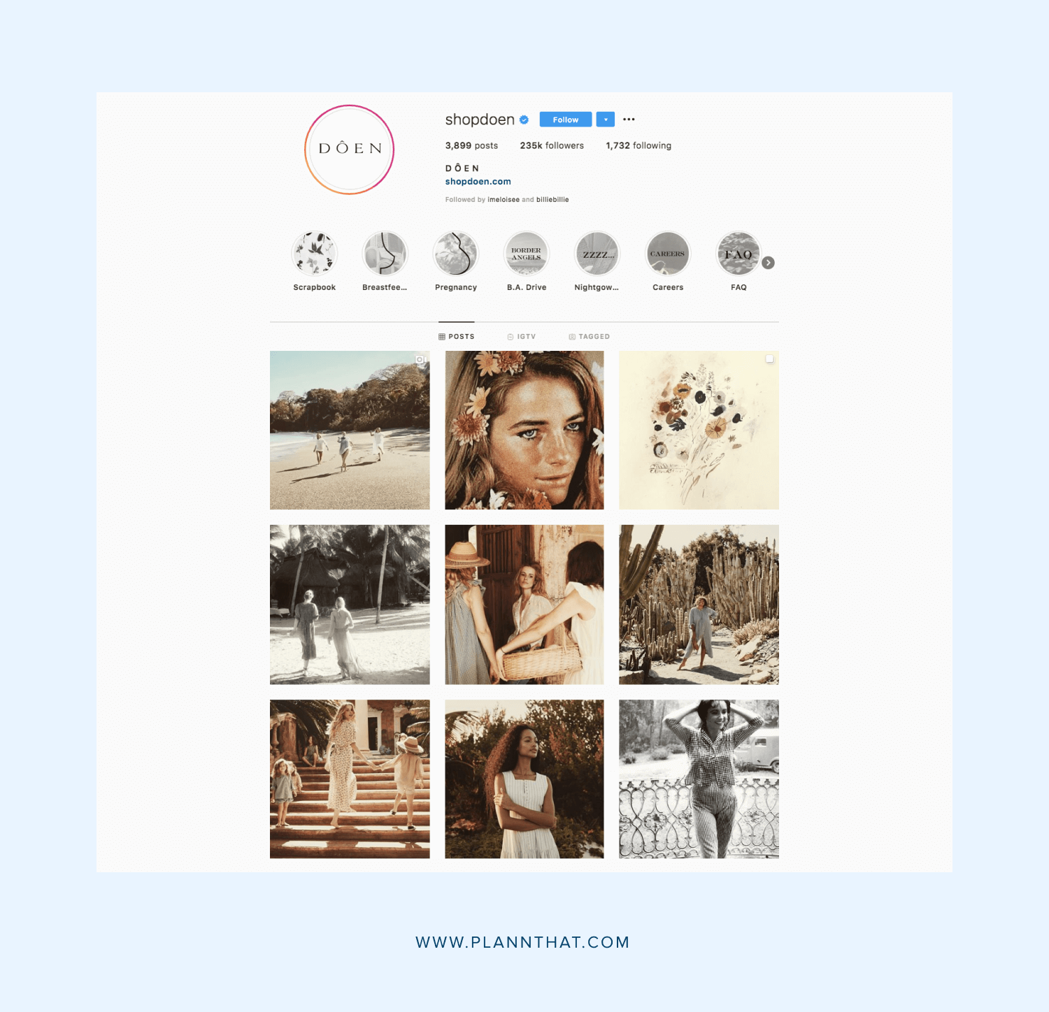
What kind of brands should use brown: You may be thinking ‘who in their right mind would use brown in their branding!?’ But hear us out! Earthier hues like terracotta and sand have actually been really important in branding lately, thanks to their grounding feel. They pretty much feel like a warm hug! Brown shades are popular against sustainable fashion brands and anyone with more sustainable and ethical values.
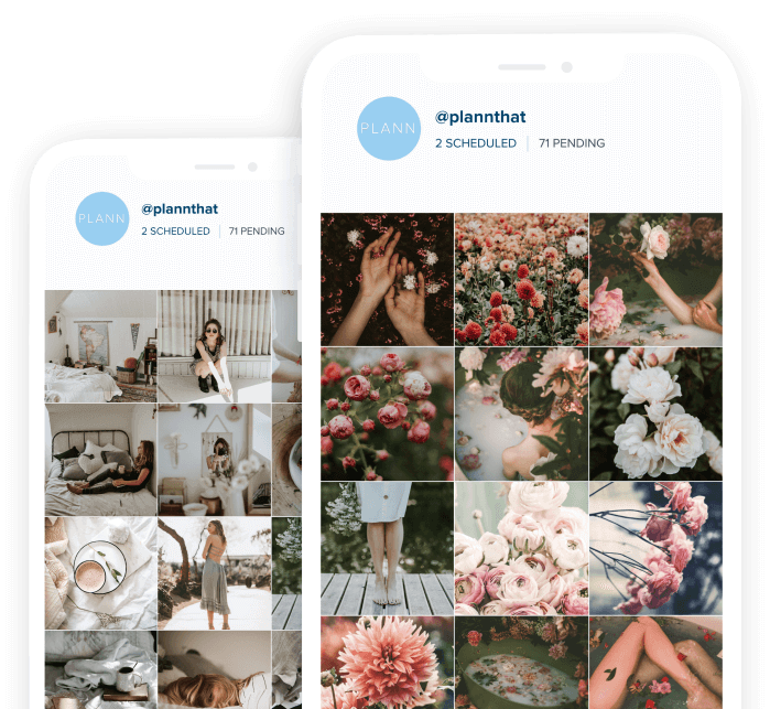
How to create a color palette for your Instagram feed using Plann
One of the easiest ways to experiment with different colors is with your Instagram feed. After all, unlike paying a designer to create a new logo or website for you, you don’t have to commit to anything long-term! You can always try out new color schemes and if they work, great! If they don’t, you can always change it up! Experimenting in this way is the perfect way to see what colors your audience most respond to.

Of course, when it comes to your Instagram feed, you generally wouldn’t use just one solid color. That would be hella boring and repetitive! Instead, you’d pick out two to five different colors that work well together and incorporate those into your aesthetic. These might be complementary — meaning they sit opposite each other on the color wheel to create high-contrast. Think, teal and orange or purple and red. Or, they could be analogous, which is when they sit next to each other on the color wheel, like blue and green or pink and purple. Often, when creating a color palette for your Instagram, you’ll have one main color and a few accent colors that just compliment it.
The good news is, you don’t have to play guessing games to determine what color palettes are going to ‘wow’ your audience. You can actually use the Analytics feature within the Plann app to find out what your best-performing colors so far have been — over the last week, month, year or even lifetime!
To access the ‘Best Performing Color Palette’ on Plann, simply head to your toolbar menu and tap on the results icon. This will open up the advanced analytics screen where you can also see how many impressions your Instagram has made over the same time frames as well reach, and best performing posts. Next to the right, you’ll see the best performing color palette where you will be able to see the exact color that has performed as well as the HEX code of that color. You’ll then be able to use those codes to create graphics in those exact same colors to keep things consistent. Cool, right?
As well as creating graphics in your brand colors, there are a couple of different ways you can incorporate them into your Instagram feed. One is simply using images that naturally have these colors in them — whether you’re taking them yourself, or using Plann’s extensive in-built library of stock images. Another great to make certain colors ‘pop’ on your feed is by using filters! When you’re in ‘Create’ mode in Plan, click on the little magic want to pull up the editing menu. Then, click on ‘filters’ and scroll through our options. You can use these to give your pics a more warm or cool feel, depending on what you go for, or even make them black and white if you’re going for a more monochrome, minimalist feel!
It’s all about experimenting with what works for you and your brand. But, by actually delving into the psychology behind what colors your audience responds to, you can ensure you’re going beyond just a pretty feel and creating a powerful and persuasive one.